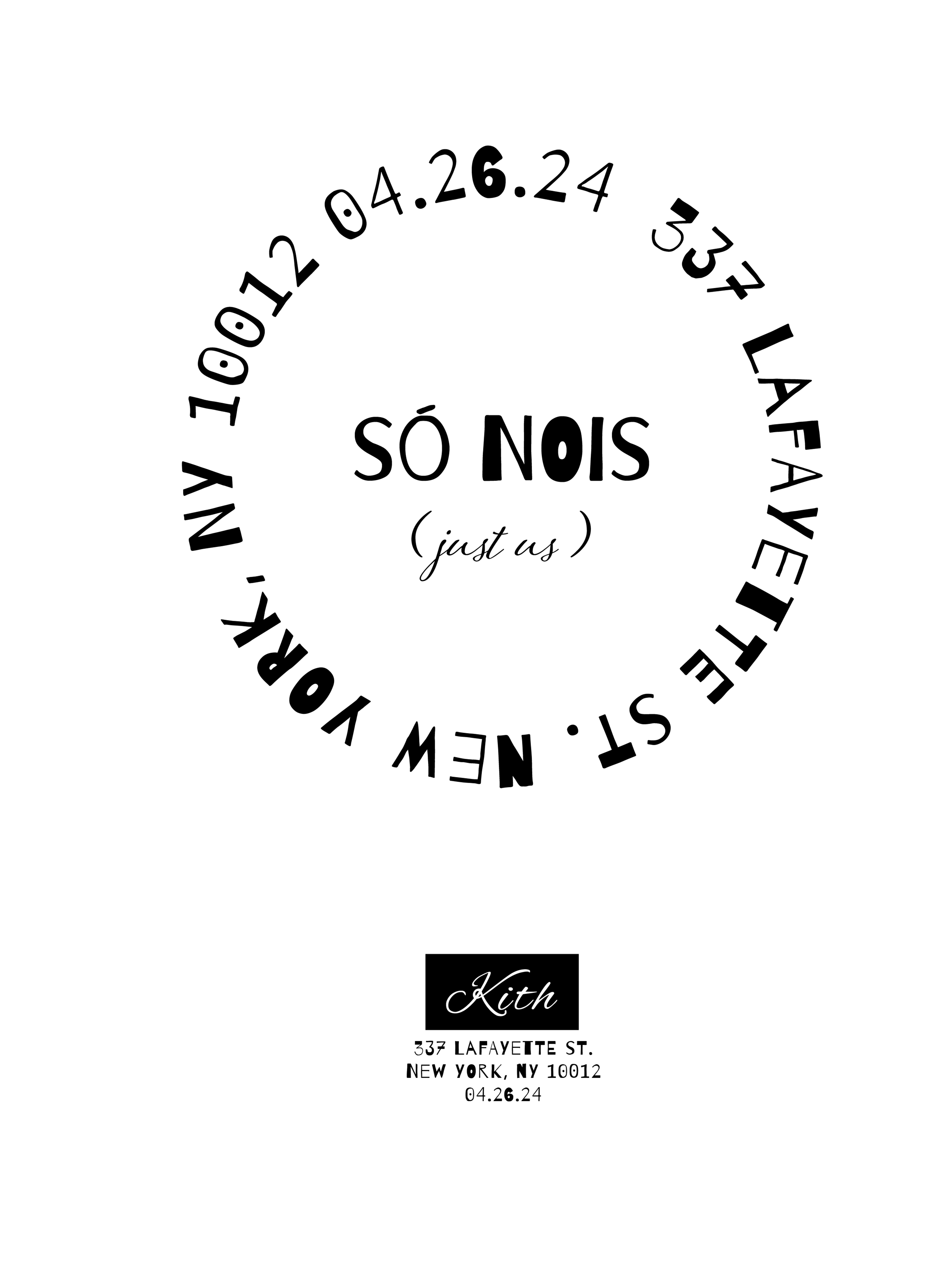
Só Nóis
Visual Identity | Campaign
só nois was born from a feeling—something I couldn’t fully explain in words, but knew in my bones. It’s that unspoken connection you have with people who just get it. The title comes from Brazilian slang, meaning “just us,” and that’s really what this project is about: shared codes, quiet confidence, and the energy of being part of something that doesn’t need to be explained. I started developing the concept while imagining what a collaboration with a brand like Kith could look like—something rooted in where I’m from, but able to speak globally. The pieces pull from the raw textures and bold spirit of Brazil and merge them with a cleaner, more elevated streetwear language. Favela typography, sun-worn fabrics, familiar slang—everything has intention, even when it feels understated.
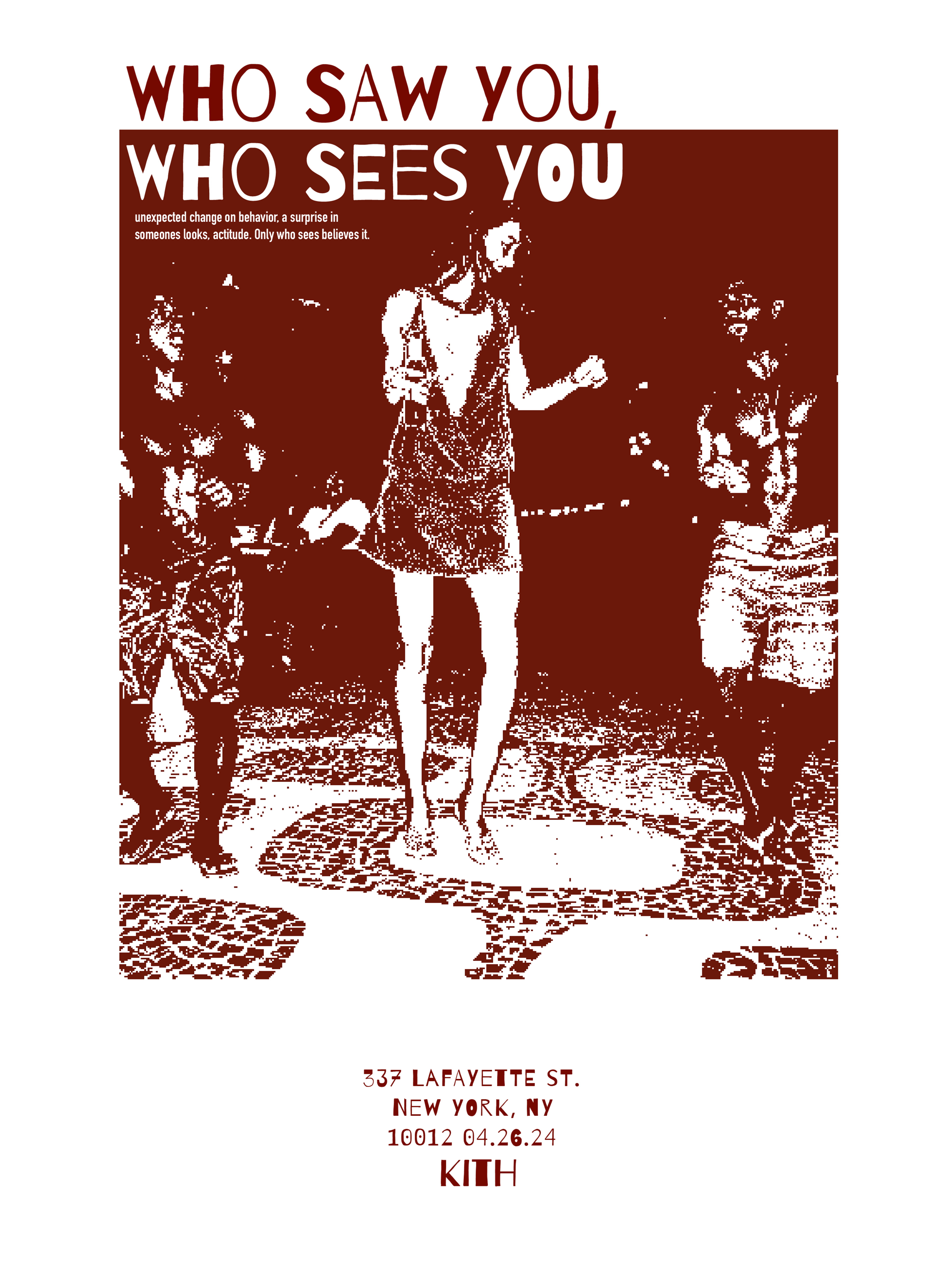
The posters that come with the collection have direct English translations, but they don’t always hit the same—and that’s what makes them feel real. That gap between literal meaning and cultural emotion is where the authenticity lives. It’s not about perfect translation or making everything digestible; it’s about being honest to where it comes from. só nois is about connection—not the polished kind, but the layered, messy, evolving kind that exists between cultures. It’s a way of showing up fully and creating something that feels local even when it moves globally. A reminder that our stories don’t need to be simplified to be powerful.